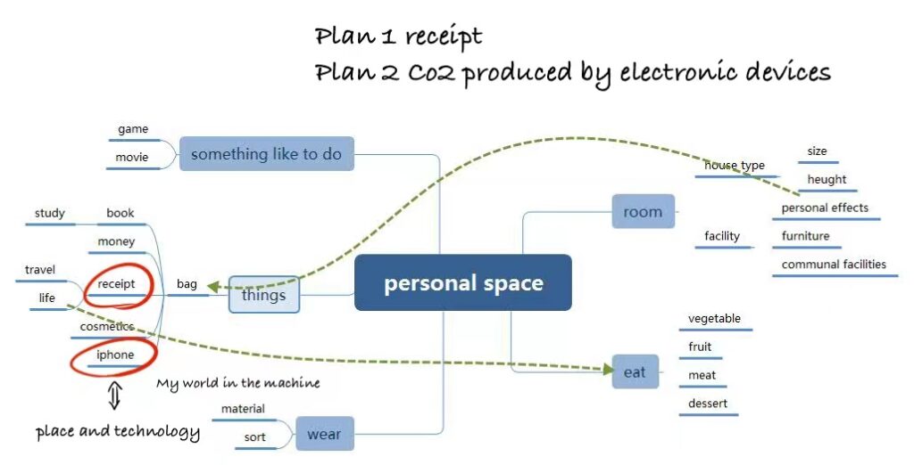
The topic I chose was personal space and place and technology, I thought it was a good opportunity to know myself.
Mind map
The computer heat dissipation (The sound is getting louder and louder)
After brainstorming, I initially formed two plans. The first project is to visualize my receipt data to understand my life trajectory and preferences. The inspiration for the second plan came from the fact that when I was doing homework with the computer, the overload of the computer led to heat and produced a lot of gas. So I wonder, how much carbon dioxide can be released by the electronic devices I use in a week?
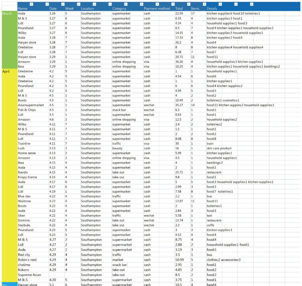
Data collection
Plan 1
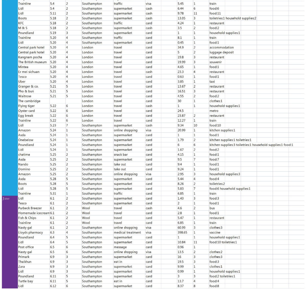
When I came to The UK, I got into the habit of keeping track of my expenses. These are all my receipts. I have extracted the information from the receipts and classified it and input it into the computer for easy statistics. The categories are month, date, week, place, classification, payment method, item type, etc.
In the first tutorial reporting the data and plan, Dr. Aldred suggested that it would be better to focus the research on Plan 2, so I did not extend this plan.
Plan 2
Computer
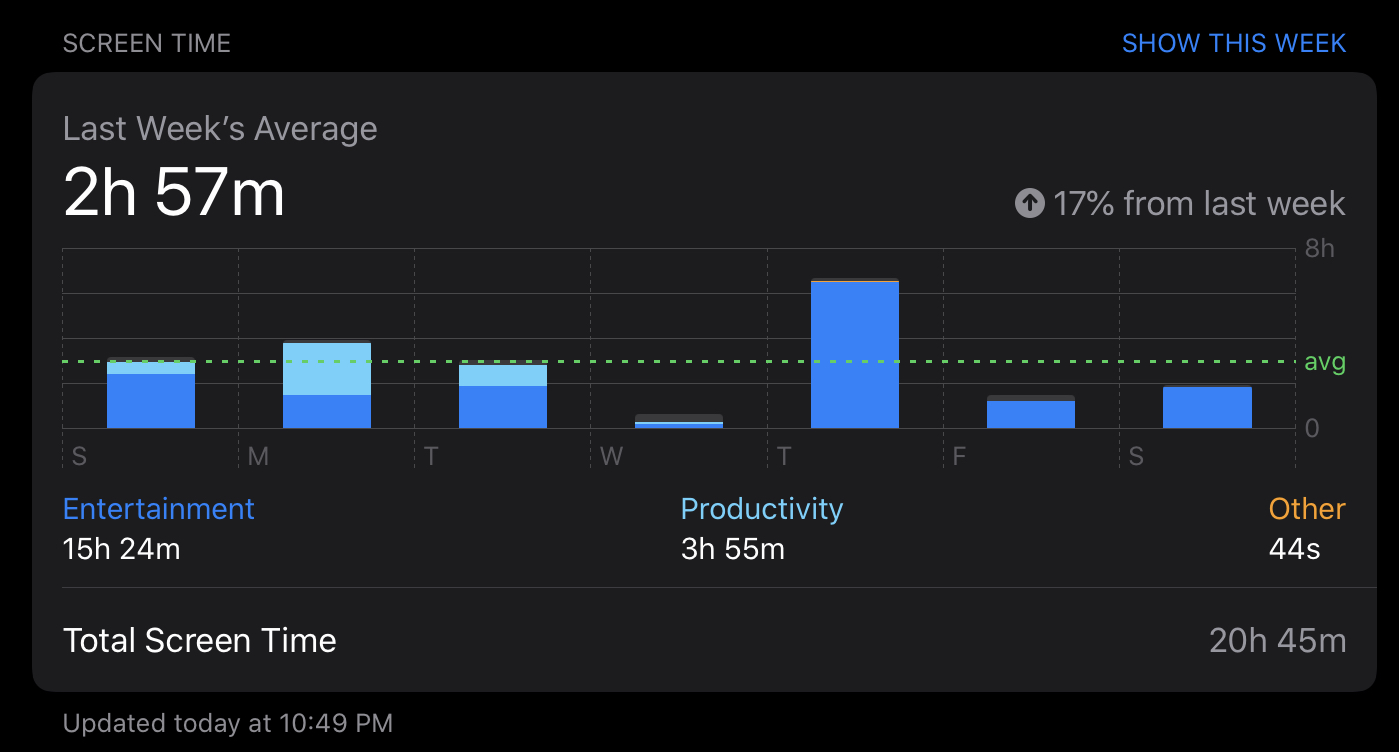
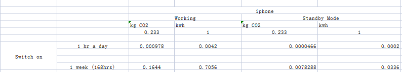
Iphone
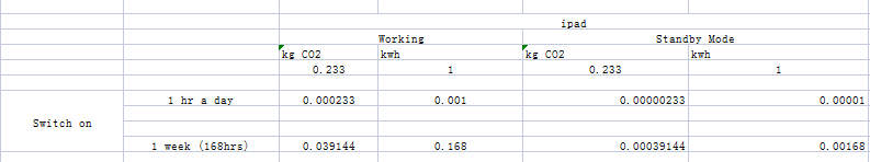
Ipad
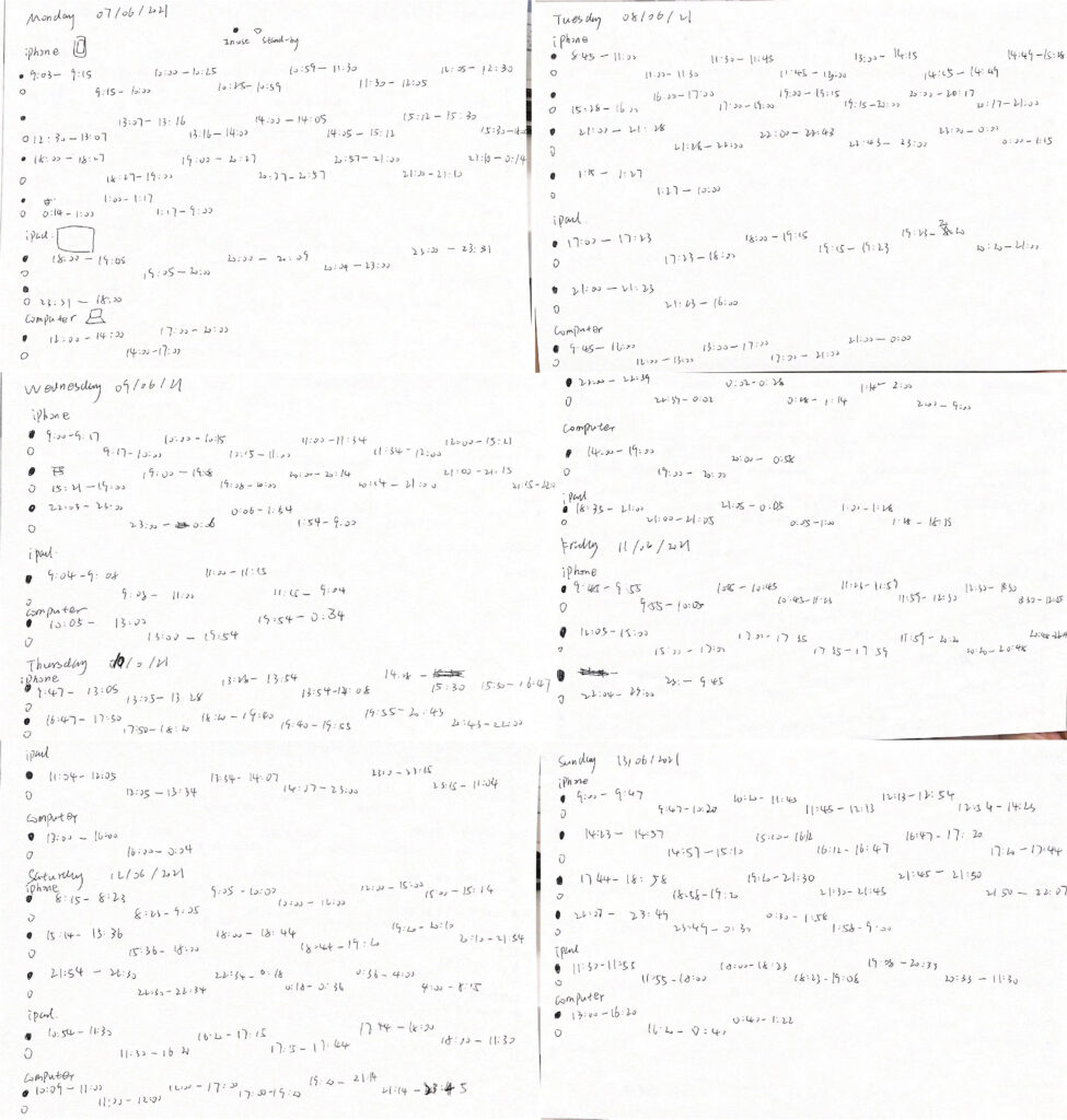
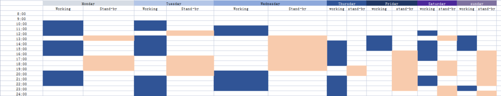
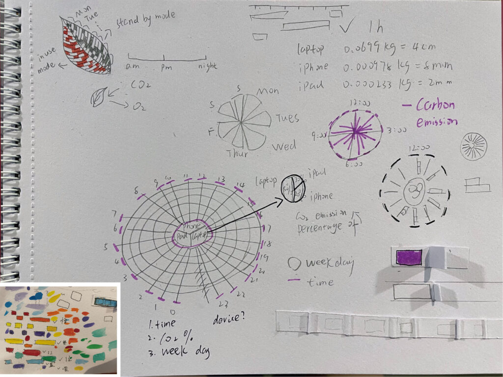
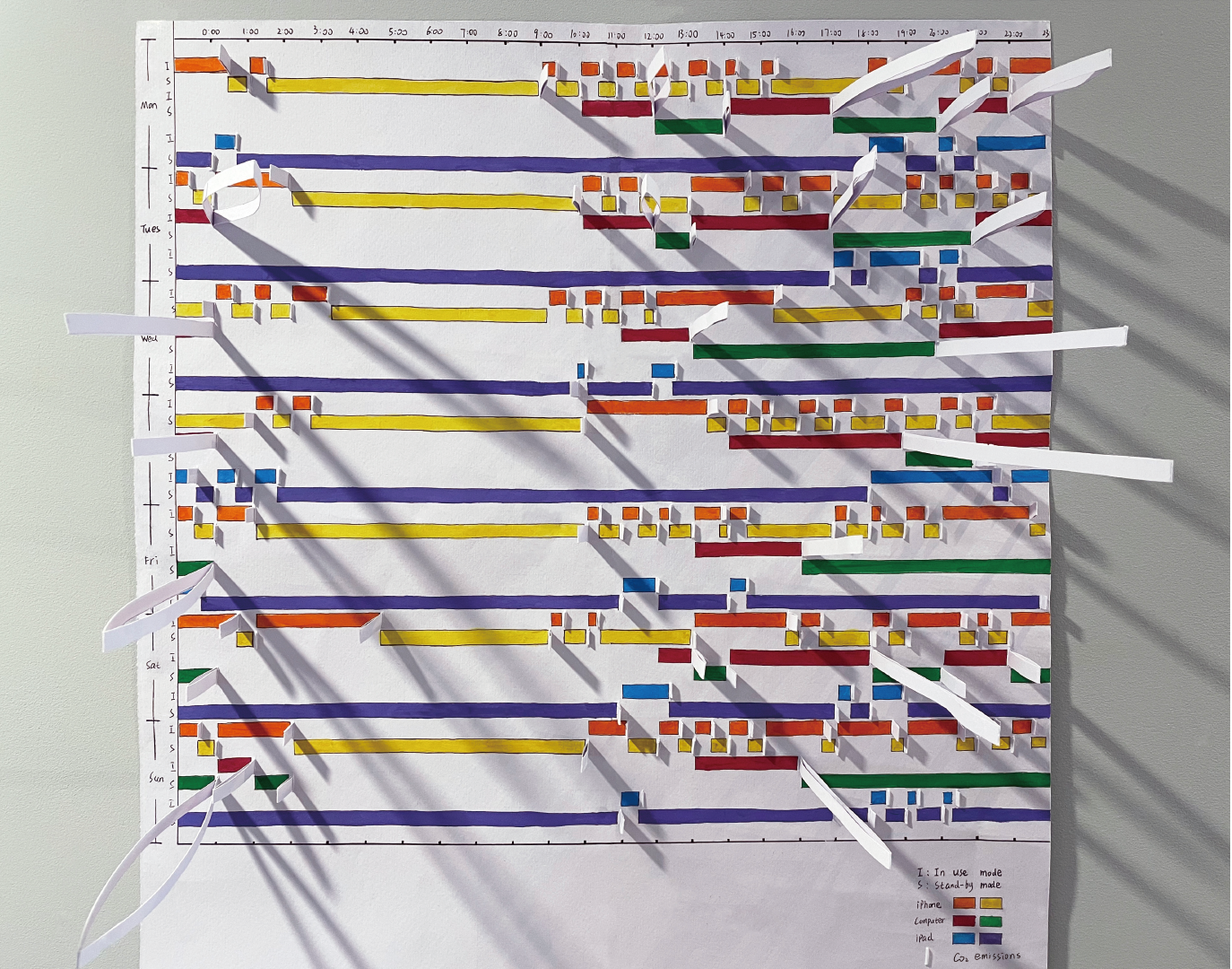
Because I have three devices: Iphone, IPad and Computer. So I recorded the standby and use times of all three devices for a week.
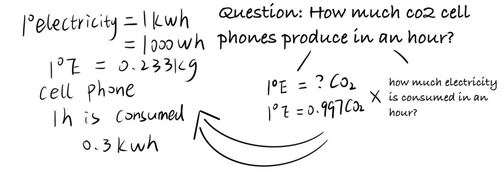
The question now is how much carbon dioxide is produced by using different electronics in different modes for an hour.
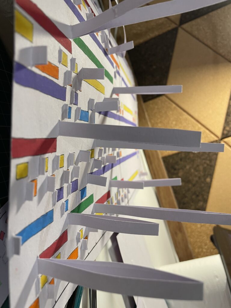
I tried to make a model to express the amount of carbon dioxide.
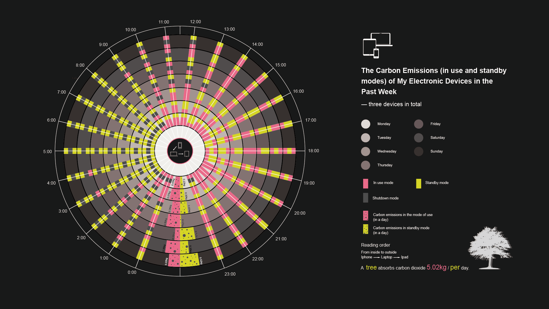
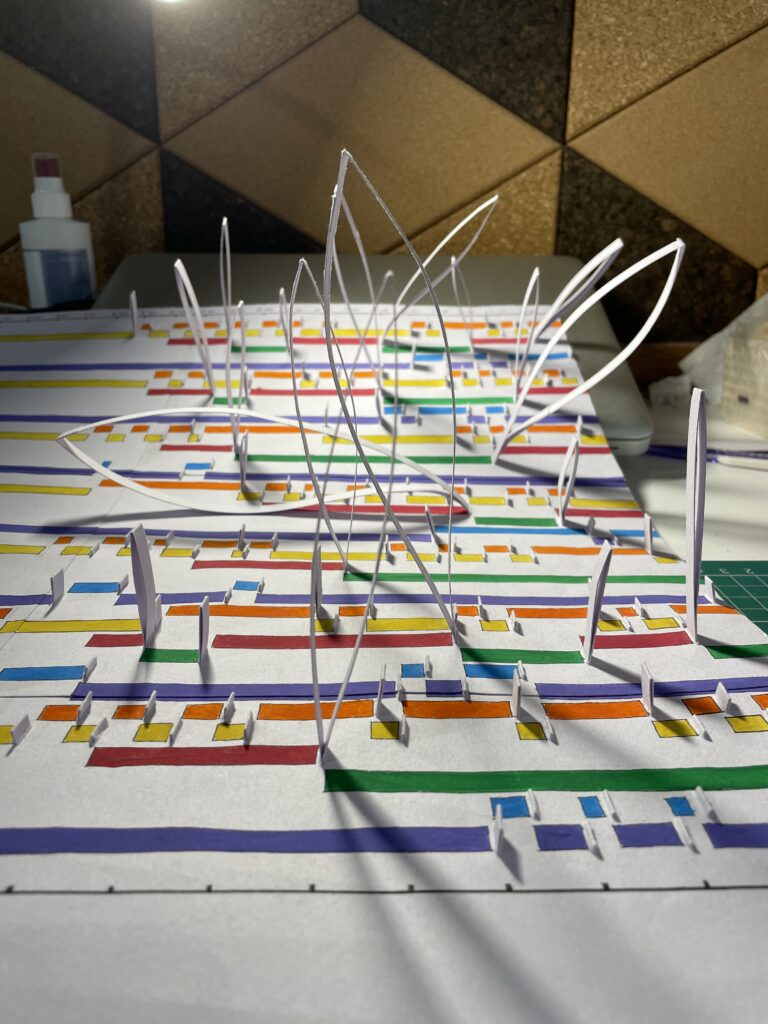
Final work
First
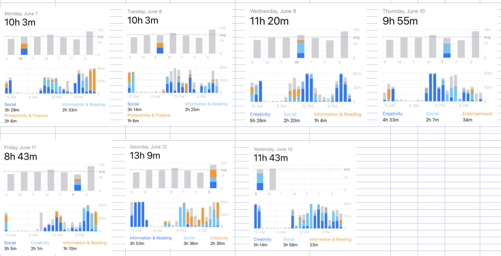
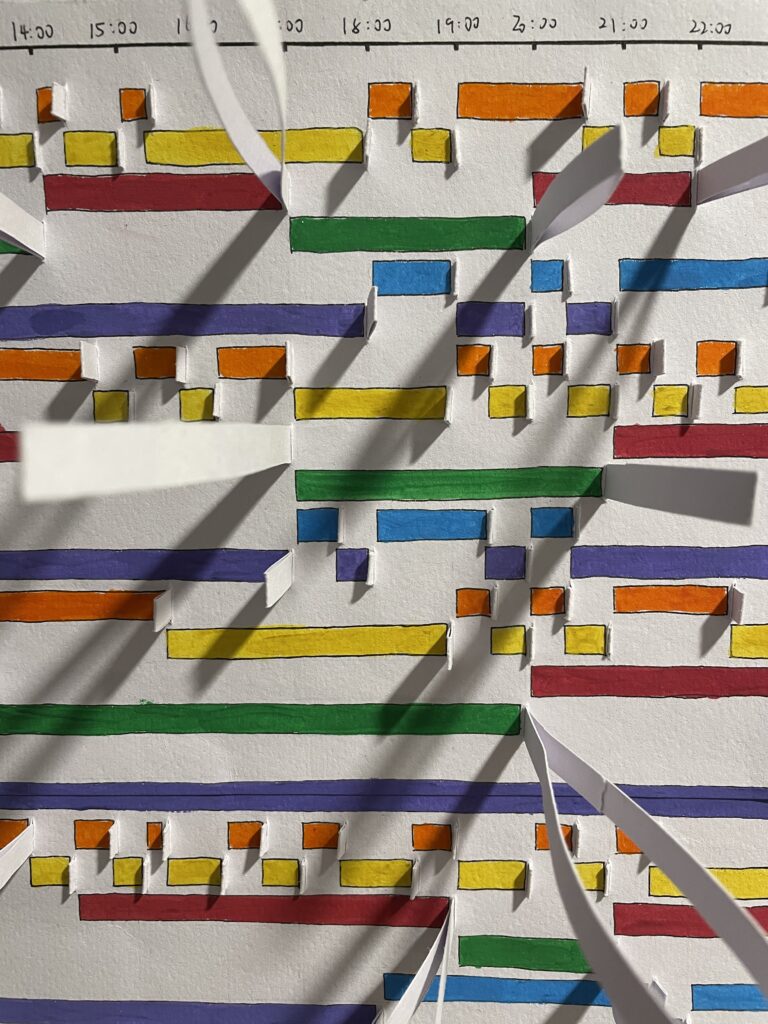
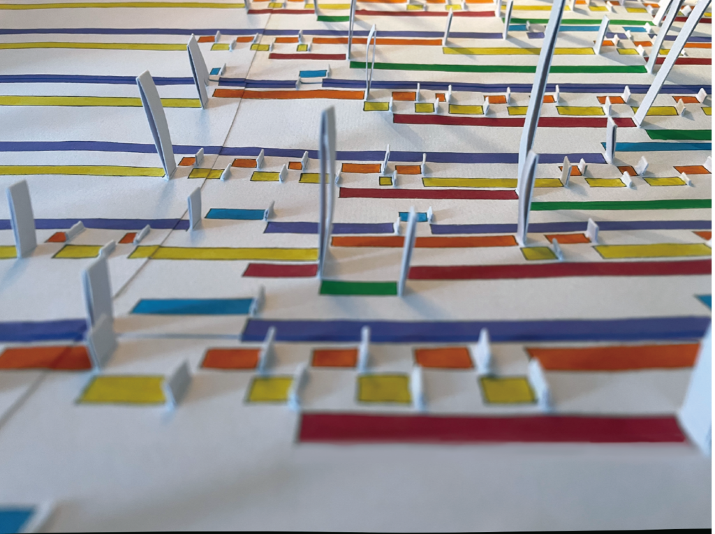
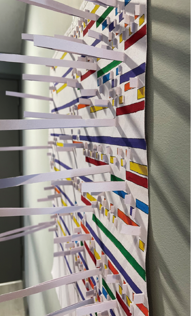
This data visualization mainly shows the usage of three electronic devices in a week, and summarizes the carbon emissions generated in a week, accompanied by the data of carbon dioxide absorbed by trees in a day. I hope that the comparison of data can trigger the thinking of the audience.
Second
This data visualization allows for a more intuitive view of carbon emissions from different devices at different times of the day, and can be compared with each other.


 Next article Blog 2 N°5 Culture Chanel Book